

Crypto futures trading requires you to monitor the overall performance of the asset. You can ace trading crypto by learning to customise basic crypto charts that align with your trading strategies.
In this article, we will take you through a step-by-step guide on customising chart layouts and performance indicators.
Let’s explore how you can fully customise your charts on Bitunix to enhance your trading strategy.
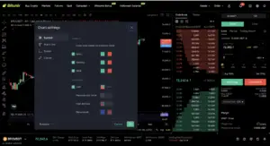
The most common colours used in candlestick charts are red and green. On Bitunix you can change the colours of the candles and other patterns. To do so, you need to navigate to the trading panel and select chart settings.

As you can see above, the colours of the candle and wick can be changed easily. Additionally, you can also enable price lines to view the trade data more seamlessly. Besides customising the chart, you can also change the default time zone – UTC to your time zone.
Watch our step-by-step tutorial video on How to customize trading charts on Bitunix?
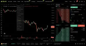
You can change the graph style from basic candles to hollow candle, area, high and low graph, baseline and many more unique indicative graph styles. This array of custom features are built to make your trading experience a breeze.

Following are the different graphs and how they can help you trade better:
The multi-chart window feature enables you to manage multiple trading pairs and strategies all in one view. This innovative tool enhances your trading experience by offering greater control, real-time order tracking, and flexible multi-chart views.
Whether you’re trading futures or spot, this feature provides the freedom to monitor and act across different markets seamlessly on a single screen.
To enable multi-window charts on Bitunix, head over to the layout icon and choose a new layout.

To view multiple crypto pairs disable the Sync Layout. If you wish to track multiple indicators on different charts, simply enable the Symbol Sync Layout.
You can watch the step-by-step multi-window chart tutorial to learn more.
Additional Reading: What are the Different Order Types in Crypto?
Before we dive in, let’s understand why technical indicators are important in the world of finance. Technical indicators are mathematical calculations based on historical price, volume, or open interest data. They help you make informed decisions by highlighting trends, reversals, and other key signals in price movements.
Some commonly used indicators include:
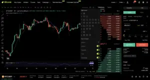
To add technical indicators, click on the indicators icon and choose an indicator from the list by clicking on its name. Each indicator customizes your trading panel allowing you to adjust its settings to match your trading strategy.
Bitunix is one of the world’s fastest growing professional derivatives exchanges, trusted by over 3 million users across more than one hundred countries. Ranked among the top exchanges on major data aggregators, Bitunix processes billions in daily volume and offers a comprehensive suite of products including perpetual futures with high leverage, spot markets, and copy trading. Users can trade bitcoin and other major cryptocurrencies on the platform, taking advantage of advanced trading features. Known for its Ultra K line trading experience and responsive support, Bitunix provides a secure, transparent, and rewarding environment for both professional and everyday traders. Bitunix Academy adds structured lessons so you can build skills while you trade.
Bitunix Global Accounts
X | Telegram Announcements | Telegram Global | CoinMarketCap | Instagram | Facebook | LinkedIn | Reddit | Medium
Disclaimer: Trading digital assets involves risk and may result in the loss of capital. Always do your own research. Terms, conditions, and regional restrictions may apply.
